Redesigning a New Web Subscription Flow for Kono
- Dec 30, 2021
- 5 min read
Updated: Jun 22, 2025
Key results: ✦ Subscription-related support cases decreased by 54% ✦ VIP conversion increased by 28%

Some context before we start
After we decided to transition to trial after subscription, I had to design a new subscription flow to accommodate these changes.
This article is an overview on how I gathered feedback on the original subscription flow, defined the problems I wanted to solve, and referenced UX studies to apply to the new design.
Problems with the original flow
Problem 1: No trial information
In our original flow, users got their free trial as soon as they registered, but since we've transitioned to granting trial after subscription, I needed to find a way to give our users incentive to convert, and reassurance that they could cancel within 14 days.
Problem 2: Too many exit points

When we looked at actual user paths on our subscription page, we realized many potential VIPs were being led to other pages. There were too many exit points that basically encouraged users to leave this page.
Problem 3: Too many support cases
We receive 50-100 support cases related to VIP subscription every month, most of them about promotion code errors and credit card transaction issues. Our subscription and transaction pages either didn't display enough information, or had the information in unnoticeable places.
Problem 4: Pricing adjustments were made
In November, our marketing team decided to adjust our pricing, making our 6-month plan the same price as monthly plan.

This removed any incentive for users to subscribe to the 6-month plan, and by December, our 6-month plan subscription rate was 0%, so we decided to remove our 6-month plan altogether.
Problem 5: CTA below the fold

The most important action buttons on our subscription and transaction pages are all below the fold.

On the mobile page, it takes 3-4 swipes to see all three plans and their descriptions.
UX Study Reference
According to a research done by Baymard Institute, main reasons for abandonments during checkout are:

Even though the research was targeted at the e-commerce industry, I still viewed it as a reference for our new subscription flow. Out of the above reasons, these 5 were most relevant to this project:
18% - Too long / complicated checkout progress
17% - I don't trust the site with my credit card information
17% - I couldn't see / calculate total order cost up-front
11% - Returns policy wasn't satisfactory
7% - There weren't enough payment methods
These 5 items became important guidelines on how I redesigned the new flow and UI.
Launching the new design

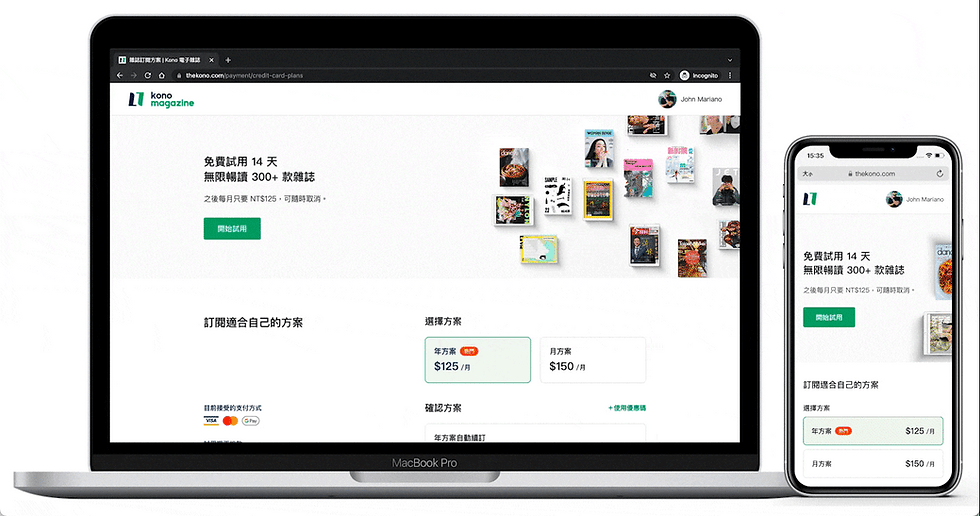
Simplified subscription process
If the user is a guest, or if they haven't activated their trial, yet, the first section they see is a call-to-action to start their 14-day free trial by subscribing. This section is clean, precise, and is designed to convey the message within 5 seconds of the users' arrival.

Users can see the trial section and both subscription options in the first fold on all devices, and if they click on the CTA, a modal view is used so that users don't need to load a new page, thus reducing incentive to exit the page.
If the user has already activated their trial period before, the trial section will be hidden, and the first section they see will be our subscription plans.
The new transaction page is divided into two columns: a quick summary on the left and two payment methods on the right.
This design is to ensure users can confirm and complete their purchase without the need of scrolling or checking for additional information they may have missed. If users are using the mobile version, it only takes 1 swipe gesture to see all the information.

Google Pay and secure payment guarantees
We added Google Pay so that users who don't trust the site with their credit card information have an alternative option.
In addition to the new payment method, I also added secure payment guarantees on both the subscription and transaction page, as an assurance to our users.

Show total cost at all times
Since users are likely to abandon their purchase due to not being able to see / calculate the total order cost up-front, I put extra effort into ensuring our users can confirm the total cost at all times.
On the subscription page, the price of our two plans is displayed by their monthly fee. In the confirmation section below, we calculate the total amount for our users, so that they are 100% aware of the amount they will be charged. For example, if one chooses our annual plan, the confirmation section will display "NT$125/month x 12 months" and "Total NT$1500".

On the transaction page, there is also a summary section, where users may confirm their subscription before they complete their payment. In the summary, detailed information include the duration of their plan and free trial, and the exact date they will be charged.

Way less exit points
The new flow has only 2 exit points in the first fold, the logo, and the membership dropdown. This was achieved by using a simplified header and removing the footer on both the subscription and transaction page.

Since there are multiple occasions where it would be convenient to have the membership dropdown available, I left in on the header. Users can check their membership status if they have problems using a promo code, which is the most common error that might occur on this page.
Redirection to membership and subscriptions
After a payment is completed, the new flow shows a thank you page, with detailed transaction information and a button that directs users to their membership and subscription page.

Compared to the old design, where users only see "Thank You" and a button that leads to our homepage, the new design allows users to double-check their subscription, which is also a frequently asked question we receive in our support inbox.
The header and footer revert back to normal once users reach the thank you page, allowing them to visit any page on the website, now that they have successfully subscribed.
Support cases dropped and conversion grew
The new design was launched in January, and the results are great!
Support cases decreased by 54%
We used to get an average of 68.75 support cases per month regarding VIP subscription related issues.
4 months after the new flow was launched, the average number of subscription-related support cases has dropped to 31.75 per month, which is a 54% drop!

Slight increase in conversion rate
VIP conversion on our website increased by 28% since the new flow was launched, while total sessions remain the same.
*We weren't able to do an A/B test this time, so this result is based on the conversion before and after the new design was released. However, as mentioned in Increasing VIP Conversion by 122% with a Simple Change to Our Free Trial Model, we had already done another successful A/B test that increased our VIP conversion by 122%.


